Hi all!
Couple of days from NAB, iPad just went out and from what I read it looks pretty good. So I think it’s the right time to start a pretty philosophical subject about the difference between looking good and looking right!
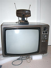
As an artist, one of the most important things is to be sure of what would go out of the machine to the world. For years it was quite simple, since the main output was video, a well understood type of signal, with standards, and then it would be broadcast to whoever on Earth, but most certainly to a CRT monitor since it was the norm by then. So the solution was quite simple, you bought a CRT video monitor, made sure it was conforming to the standard, on the higher end ones you could even have a probe with an automatic calibration tool, couple of buttons, sorted. Then it would be different from Joe Average to Sergio Medio to François Moyen, but at least the primaries were always the same and most would know how to set it to get a good picture.
 Now story is a little more complicated, since you have tons of new different different display technologies: LCD (in different flavours), LED, Plasma, OLED, SED, FED for monitors, and then LCD, DLP for projectors (and Sony has Laser ones). And not only they have funky colours, but they also often have some funky processing occuring to the signal to make it “look good”. Worst of all, sometimes you just can’t get disable this special sauce, which can be pretty annoying in my job (will explain later).
So how would that impact the work of a colorist? Well, a colorist is supposed to make a picture look good, or at least matching the taste of the client, which might be a (very) different thing. But this picture has to look like that on every display it will be shown on. And that starts with the one used for the decision, which has to be the best possible. So what is the best? In the olde tymes, once more it was easy: the best was the most representative of what people had at home, but now it’s all over the place: different technologies, but also different sizes, and Macs.
Why Macs? Because those guys had a gamma default of 1.8 when everybody else was 2.2 (we could also discuss that, but one thing at a time), and with the latest version of OS X they have changed it to match everybody else, so good fun to come. Come back to our display problem, what to choose? Broadcast Grade One CRTs (Grade One is a quality label that says it can be used for quality control and colour grading) are gone and if you see one there is a good chance the tube is so old it’s not showing the right colours anymore. Some companies have come with replacements based on LCD, which are now good, but they still suffer a bit from viewing angle issues, and then the size: for years the standard was to work on 24′ or 32′ monitors, but now it’s getting rare to see something smaller than 40′ in homes. And if you take a big grade one LCD, not only it would be really expensive, but also you would have more viewing angle problems. Arrgh!
Plasmas have less viewing angle problems, good quality and nice colours, but also weird processing occuring. Need to remember the plasma technology is basically on/off, not easy to do a half plasma. They work well as client’s monitor, because it’s big and the big Panasonic and Pioneer Kuros can match pretty well the colours of a reference monitor, but they would probably disappear in the next couple of years because of their power eating.

DLP Projector, Picture Credit: big-ashb @ Flickr
So what about projection? Well, good projection is expensive. You can have “good looking” HD projection, stuff from home cinema, but those are not made to be used 10 hours a day, so the lamp budget might be a problem and their stability may not be up to what’s required. It’s also tempting to make a big picture, but the power to the screen is expensive and there is a pretty big hole in budget between the home cinema class projectors and the professional ones, meaning moving from a 2.5 meters base screen to a 4m might mean multiply the price significantly. I have also met projectors that were impossible to calibrate since they had dynamic processing, meaning some kind of intelligence was trying to make the picture “look good”, changing the contrast and brightness depending on the content, and there was no way to disable that stupid thing. No way to make it “look right”. Ask before buying.
Last thing about projection, you mostly have to work in a dark room. It’s OK for film jobs, but difficult to manage for video work. Plus, it can make people (including myself) feel depressed after a while.
So is there a solution? Well, there are always good compromises to find; the budget will push to a couple of propositions, then it’s about finding the right one. It’s really important to think about the final medium of the project and the type of projects that would be done in the room. At the end of the day the most difficult thing to manage is the guy handling his iPhone and telling you that’s what he wants or the exec you sent your Quicktime too saying it’s too dark on his MacBook… good luck!
To be continued with cameras…
Cédric
PS1: If it’s for film output, then it’s a little more complicated and I would explain that in a future article. If there is a hurry, call Workflowers
PS2: if it’s for stereo output, then it’s a LOT more complicated. You should really call Workflowers
PS3: why start with a chameleon? because his main concern is not to look good, but really to look right. Maybe that changes when playing with chameleon girls, but that’s enough for today.
Pictures are used under Creative Commons license


