Now that DI has really taken off and the cost of owning a system has fallen sharply, the number of working colorists has grown just as dramatically. This boom in color grading may also have caused significant changes to the perception of images by the audience.
Similar changes have been reported and described in language, where one consequence is known as a dead metaphor. The last paragraph was full of them. DI cannot literally take off and growth is something organic, something only living organisms do. It does not strictly apply to a number, which increases. But saying that the number of colorists has “grown” creates symbolism and meaning that “increases” does not. The first time growth was used for numbers it would have had a very dramatic effect. Yet now, such use is so commonplace we hardly notice the transition from metaphor to everyday usage.
In our industry some looks are becoming so familiar that the value of their effect is diminishing, and becoming mundane. Any look is striking the first time, but with increased viewing the interest wanes. Eventually we comprehend the intended nuances without really noticing the look. The heavy blue cast once popular as a day for night grade is one example. It is still seen as a way of denoting night, although it is not lifelike – we do not see the world as bright blue when it gets dark. It works, audiences accept it, but it can now look cheap rather than impressive. Visual metaphors can even be the source of their linguistic counterparts. The “flashback” was once a visual effect, but is now used to describe any sequence that looks back in time, even if the flash effect is not used. Using a flash as a device to show a temporal jump in the narrative is another dead metaphor. It serves its purpose but in a dull, unremarkable way. Most colorists consequently search for more creative approaches that are more engaging for the viewer and add deeper meanings. In short we look for fresh visual metaphors.
Some techniques originally introduced for effect have been copied and re-used so often that they are now recognized as identifiers for certain genres and plots. The original sudden impact is gone and the grades have become cultural messages. Victor Shklovsky described this in Art as Technique (1917)* where he wrote
…in order to make us feel objects, to make a stone feel stony, man has been given the tool of art. The purpose of art, then, is to lead us to a knowledge of a thing through the organ of sight instead of recognition.
This is neatly explained by A D Jameson, who writes**
Shklovsky argues that there is a distinction between “recognition” (“automatized perception”) and “seeing.” Recognition occurs when you look at things without seeing them—when your surroundings have become so familiar that you tune them out. Seeing, by contrast, happens when something causes you to look again, and to regard a thing as though for the first time.
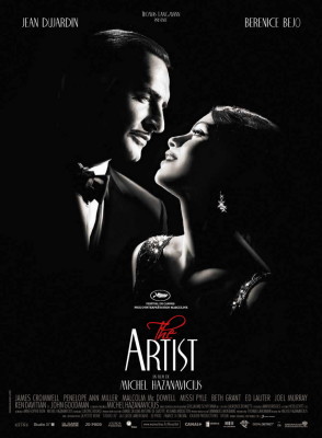
Some looks have actually benefited from this shift in audience perception. Black and white films, which used to be common because of the limitations of technology, are now infrequent but continue to get made for all the right artistic reasons. They generate interest from critics and are striking to watch since they are now extraordinary. Ironically, from the colorist perspective, these new black and white films perfectly demonstrate the future of our craft. Firstly, films such as The Artist (2011) and Control (2007) demonstrate how the look should be justified by the content. Secondly, black and white projects are now shot in color because it provides more control in postproduction, which means that cinematographers understand that the image they create is captured in camera and made in the grade.
Recognizable looks, regardless of whether they are inspired by a colorist, copying, or excessive use of plug-ins, often fail – not just because audiences are desensitized to them, but because a successful style in one project, does not always accomplish the same depth in another. The look then appears more as homage or endorsement to its first use rather than as an enhancement to its latest implementation. The grade must integrate with the material and add further dimensions (not necessarily of the 3rd kind) to the project.
Projects with similar themes might naturally lean towards similar grades because of their content, but sometimes it is better to resist the temptation to use the obvious color palette. Looks have their maximum effect the first time they are seen. Later examples must be technically better or more intricately applied to be effective.
Colorists must always stay one step ahead of the audience. There has been a period of increasing color effects to compensate for their diminishing impact, but sooner or later we have to introduce newer, defamiliarizing approaches.
Most of the visual metaphors employed by colorists are synaesthetic, since they evoke the other senses. ‘Warmer’ and ‘colder’ are surely amongst the most common terms used in a grading session. The unique relationship between the eye and the brain makes cross-sensory triggers especially powerful.
There are many ways that we might overcome the diminished impact of dormant or dead color metaphors. Creating fresh ones is an obvious approach, but it is not always easy, especially if the look has not been planned during art direction and shooting. Other possible solutions are subtlety, juxtaposition or a return to the natural image.
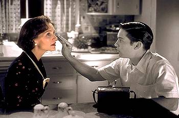
Juxtaposition is a great way to get the best reaction from a look, and stands the test of time. Some of the more extreme examples are the transition from black and white to color in the Wizard of Oz (1939), the red coat in Schindlers List  (1993) and the blushing colors of Pleasantville (1998).
Pleasantville paid homage to the era of black and white television, and more recently two 2012 Oscar nominated films pay direct tribute to the history of cinema – The Artist (2011) and Hugo (2011). These and countless other movies reinforce the cultural heritage that colorists can refer to.
When everything has a look, breathtakingly good normal images will stand out. Then eventually, normal itself will lack impact, looks will get stronger and the cycle repeats. Along the way our cultural recognition of motion pictures evolves and adapts, just like the spoken word.
Kevin’s Popular Looks class is a practical workshop that investigates ways of grading fresh new metaphors and exploiting visual clichés.
Happy Coloring,
Kevin Shaw
References:
*Victor Shklovsky: Art as Technique (1917) ecmd.nju.edu.cn/UploadFile/17/8082/technique.doc
**A D Jameson (http://bigother.com/2011/08/23/using-viktor-shklovsky/)


