There is something very exciting and motivating about finding a new technique. Sadly the more experienced we become as individuals and as a profession the less those truly inspired moments come. So I am happy to share this new find with you. Maybe I am not actually the first to have discovered it, but that does not diminish the moment for me at all. It is new to me and I have not seen it described elsewhere.
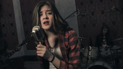
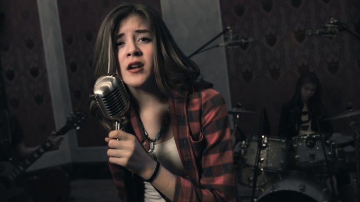
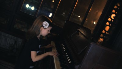 Like most of you, I spend large amounts of my time practicing and exploring grading in the hope of getting better and learning more. However, this story starts with an email from the O’Keefe Music Foundation. The email was for a good cause, I did have a gap in my schedule and I have always been partial to music videos. I asked to look at the edit before committing and was blown away by the energy of the performance. Plus there was the undeniable absurdity of such a young band covering a track as mature as “Sober”. Kala, the lead singer, is just 14 years old. I immediately liked the conceptual possibilities and signed up. The proposed look was of Lana Del Rey at Corinthia London
Given the shoot and location it seemed quite a challenge. And there you have it – inspirational, conceptual and challenging, all the ingredients for something special.
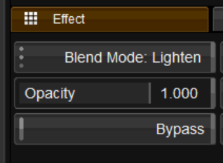
I started looking for a way to get close to black and white, but keeping a natural skin tone. It had to feel dark but not fantasy-like so I did not want to get close to Sin City, and I did not want to be pulling keys in every shot. I started with the Channel Mixer to get a black and white layer, and then used a Lighten blend mode to combine the color and b/w layers. With Lighten I could preserve skin color by adjusting the red channel in the Channel Mixer. Watch the finished video at Kids Cover of Sober by Tool and then read on if you would like to follow the grade step by step. I grade using Nucoda but I have also included the equivalent controls in Resolve.
How it was graded:
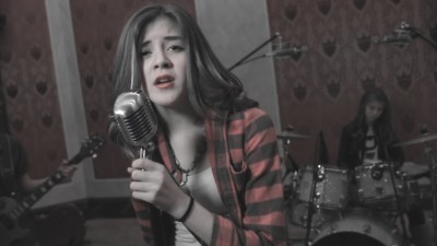
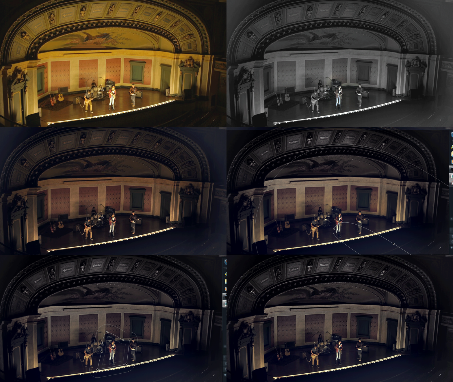
Step 1. I chose a mid shot as a reference, because the grade was all about skin tone and making it personal. Since I was working on an edit mix down that was already rec709 it did not need balancing yet. After applying the look I come back to tweak the Base layer (Resolve Node 1). The source looks like this: 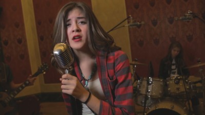
Step 2. In a second layer (Nucoda Layer 1, Resolve Node 2) I took it to black and white with the Channel Mixer.
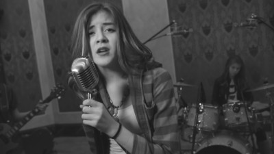
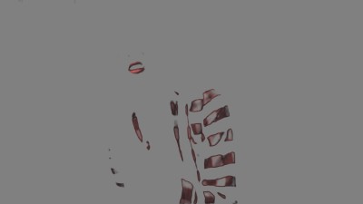
Step 3. I combined the first two layers/ nodes with a Lighten blend mode (use a Layer Mixer in Resolve). If the B/W layer is lighter than the balance layer, the image will remain black and white. So I adjusted the green and blue layers in the channel mixer to be lighter and the red darker, leaving color predominantly in the red channel.
Step 4. To keep the B/W effect in the Lighten blend I had to keep the grade quite light, so In the next layer (Nucoda Layer 2, Resolve Node 4) I added back the Contrast I wanted, corrected the skin tone with Brightness Regions White (Resolve Log Primary Highlight), and added a hint of blue to the shadows to increase the color contrast.
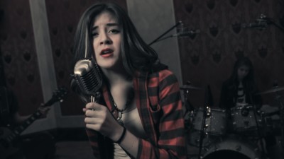
I was really happy with the look so far, especially since it had no keys! When I copied these layers to the rest of the video it had a great feel, but I felt it was a bit strong and unflattering on the portrait shots. So…
Step 5: To improve the skin tone I decided to mix back about 50% of the original color from the Base (Resolve Node 1), but then used a key to apply it to the skin only. I created a Layer 3 referencing my neutral Base (from step 1) and then used Opacity (Resolve Key Output Gain, but you need another Layer Mixer to do this in Resolve). At this point I made a few small Primary adjustments in the Base layer to get the skin tone right.
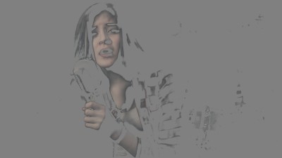


Step 6: I never liked the bright red lipstick so in Layer 4 (Resolve will be at least Node 7) I keyed the lips and used Printer Lights (Resolve Offset) and Saturation to make them more natural and less like lipstick.
Step 7: Last but not least I added Layer 5 with a luminance key to isolate the highlights, blur the matte and raise Balance White (Resolve Primaries Gain) to add a cosmetic glow to the highlights on the face.
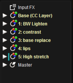 Here is my final layer list. (This is the node tree in Resolve, but resolve would need a couple more layers to do the blend and mix tricks)
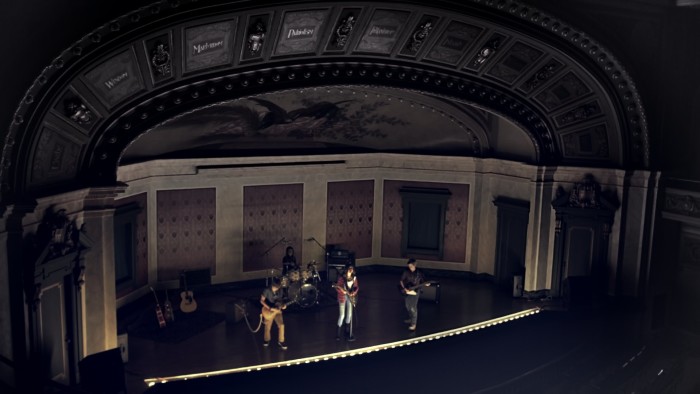
That is it, and most shots looked good with just the first 3 Layers. I like this grade because it is simple, flexible, very clean, quick and works on what could have been a tricky source (it’s shot on Canon 5D). On other shots I did some strategic sharpening and in the wide I used a few shapes to keep the look going.
To discover more about the theories behind the grade, iconic look generation and advanced color design join me in an ICA class: Next available dates are August 17-22 in London.
Happy Coloring! and don’t forget to support the kids if you can.
